
Clean and Minimal Business Card Inspiration


There’s nothing like the feeling of a delicious new set of business cards. Inspired by all-text websites, and a clean aesthetic, these modern and minimal business cards evoke the perfect mix of luxury and warmth I was hoping for. As Velvet and Gold has slowly shifted from a calligraphy-first brand, I now find myself drawn to organic and luxurious elements.
Here’s a little peek behind the curtain:
Paper:
Being in the business of paper + design, it was important to incorporate a few tactile elements. Giving my clients a premium business card indicates how I only work with the highest quality papers and respected printers. So I went with one of the heaviest paper stocks* on the market and paired it with letterpress printing so you could tangibly feel each letter. I also got it duplexed to be EXTRA thick, and chose a creamy color as a backdrop against the bold, black ink.
*Crane's Lettra 220#: 40pt
Type Inspo:
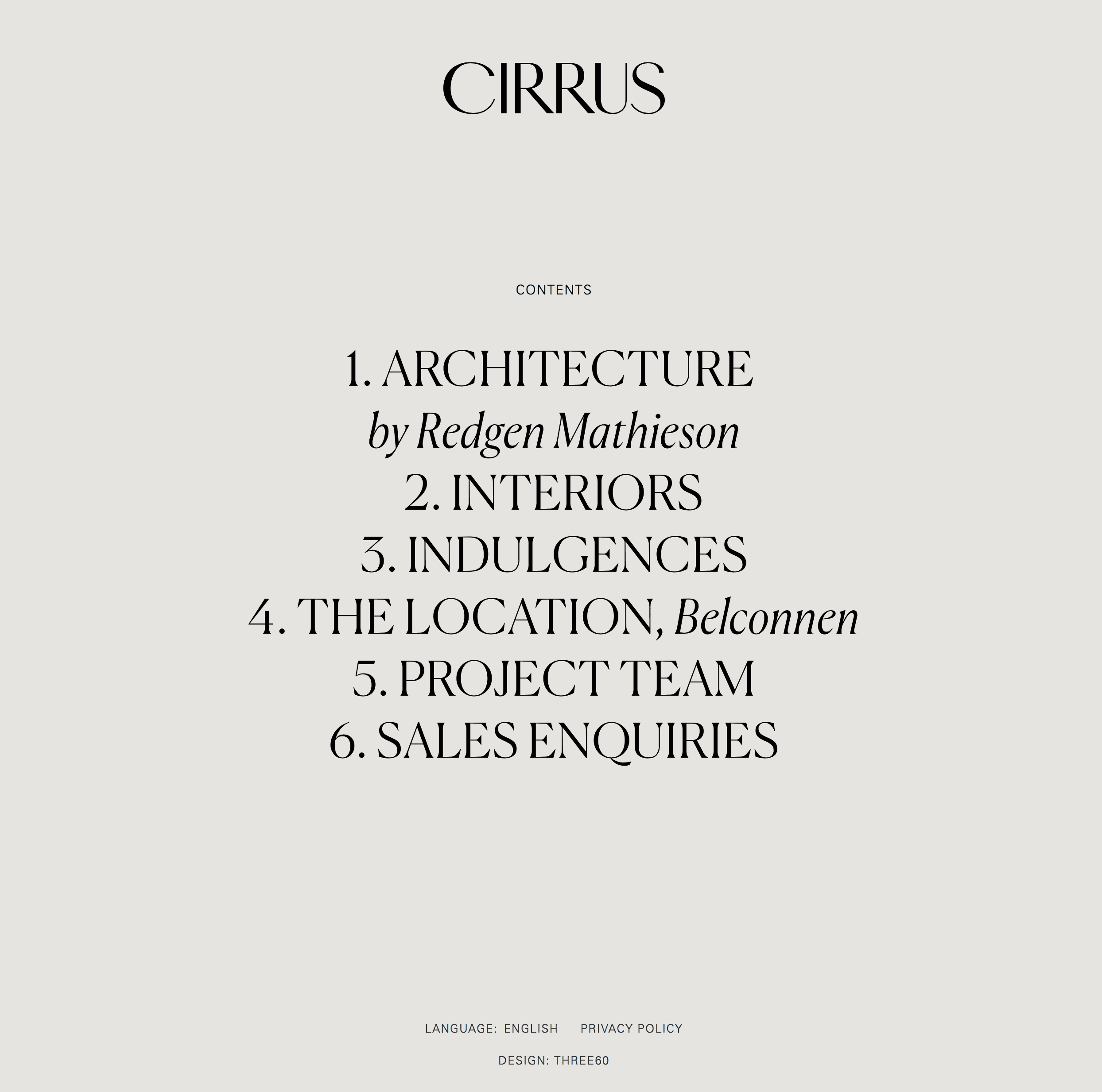
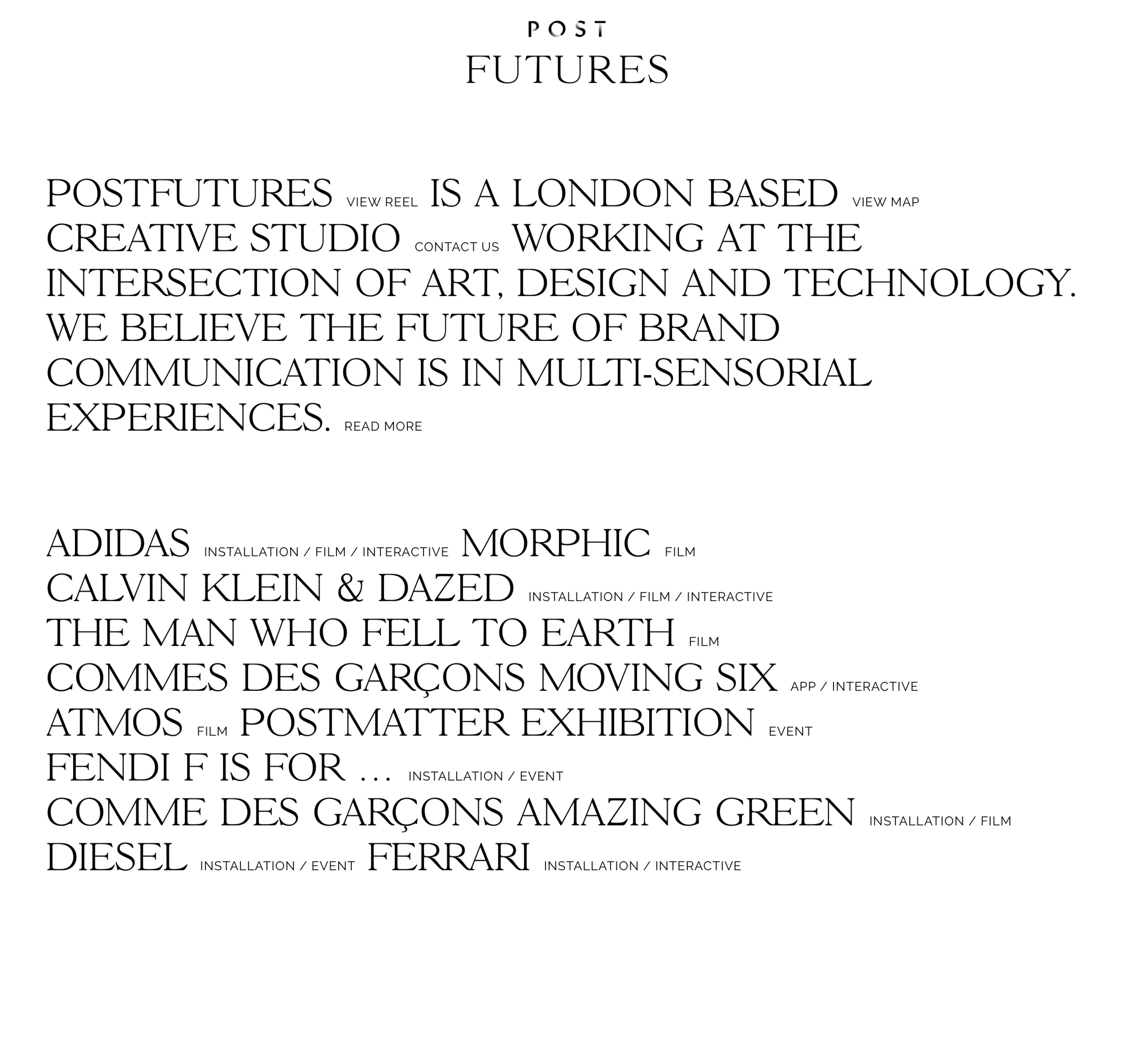
For type, large, juicy serifs would take center stage. I wanted it to appear as if you were looking at the first glimpse of a website upon arrival (an above the fold impression). I used my brand fonts of Orpheus Pro and Garamond Premiere Pro (both available on Typekit). I scaled up the main tagline x3 to increase the contrast between the info and the main header while avoiding a cluttered look.
Art direction:
Most of our semi-custom invitations have no graphics, so I wanted this version to mirror the clean lines and sharp designs.
the reveal:
Here’s the final result:


Want Velvet and Gold to design your next branding project? Click the link below: